My Design Company Logo
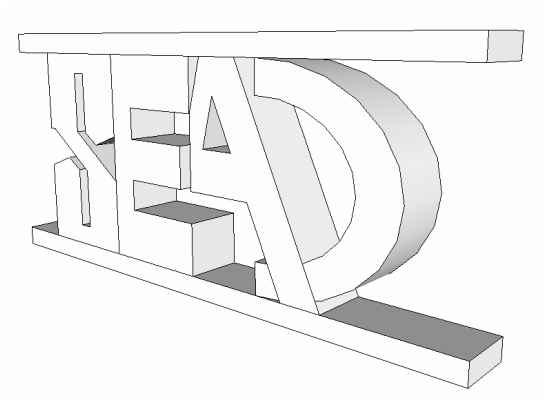
The steps to creating my design were much more difficult than the process of sketching it. I had to make all of it one piece which immediately changed my mindset for the design logo I would be making. I first thought about smooshing the letters together to create an effect of the letters combining into each other, but the "A" and did not connect well with the "D" and the "E". This led me to putting the line above and below the letters. This made it easy for all letters to connect and stay in a strong structure while maintaining their appeal to one's eye. Many problems also raised while making this on Sketch Up such as size and alignment. I had to change the size of the "D" and I had to realign the "S" indentations. Overall however, Sketch Up has allowed my logo to go into a 3D view which really allows me to envision it; and I think it turned out well.
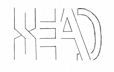
The name of my design company is Sean Edward Anderson Design (S.E.A.D.) I decided to use this design because I believe that the less complicated, the better. However, it does have its own unique touch to it. I made it so that when one is looking at it, they have to pause for a second in order to read it. The hardest part was coming up with the name, so I tried something simple (my initials and "design"). This worked perfectly because it ended up spelling out its own word, "sead," which people would read and think "seed." This is good because my design company is brand new and is only a little seed sprouting to become a large flower.
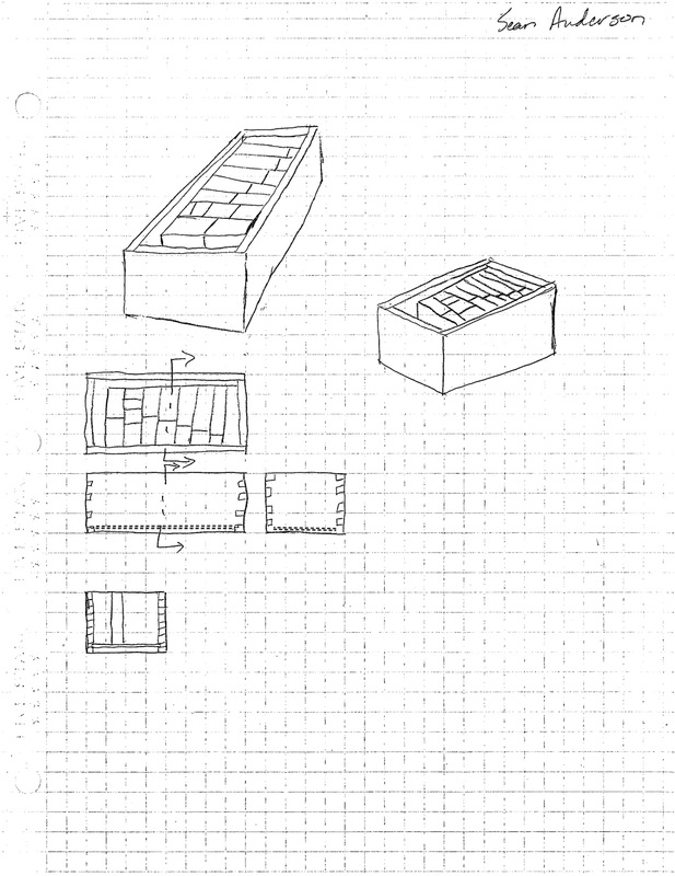
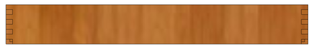
Lower School Math Manipulative's
Perspective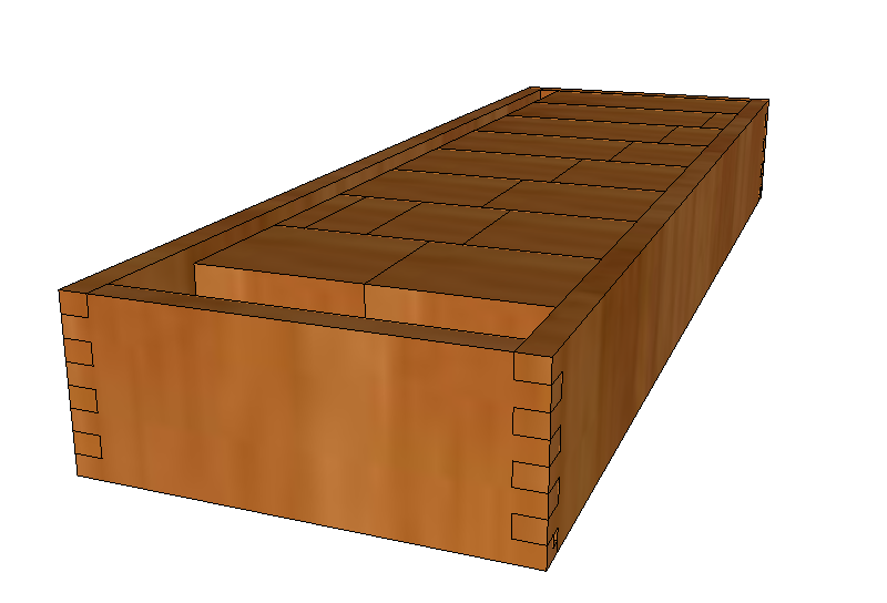
Top View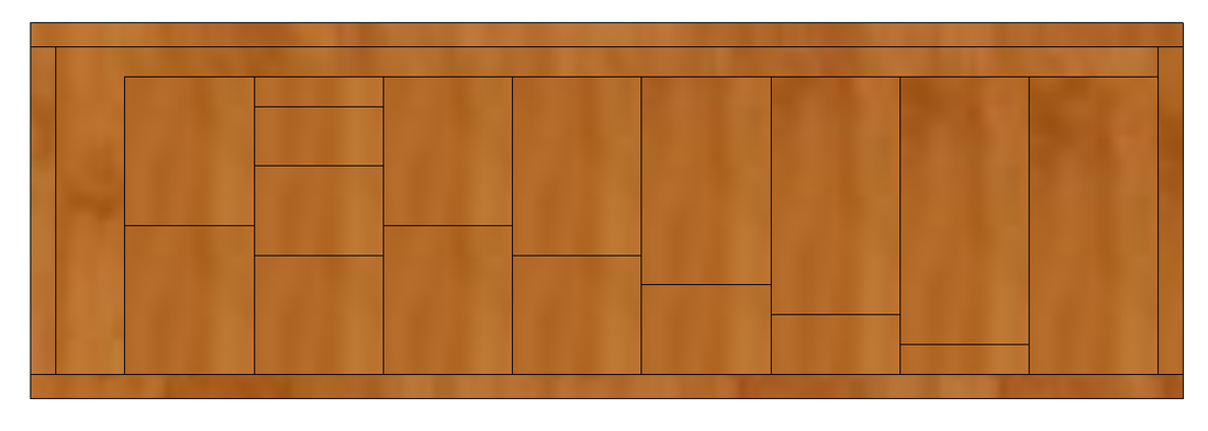
Front View |
Isometric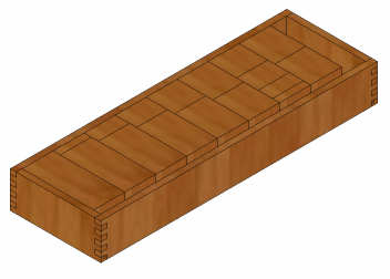
|
|
side View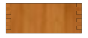
|
Sectional
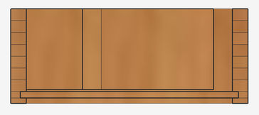
The project was to create a box that could be created by a 3D painter so that kids in the Lower School could use them as toys.
P.S. the background color for the sectional view is a different color because when using the tool to see the object like this, it projects that grayish color in the background. It should be on everyones.
